How to use Camera Raw
Camera Raw can enhance your image a lot and is a very powerful tool, but most of the time, it could be used to its true potential.
In this article, I will show and tell you how you can use the tool to increase the quality of your final edits as well as massively
as player renders.
If you would like to follow along with this tutorial, please download the following file:
Camera Raw is very powerful, but it can only do so much. How the render is lighted, and the colours of the original renders also play a big part in the outcome. So you want to make sure you choose an excellent render for your card or edits. Here are some examples of good and bad renders.
Not a good render
This Martinelli render has harsh shadows in the face and a big difference in lighting, making it hard to apply one camera filter that makes the entire face look good. Some parts of the face are also overexposed, making the face lose precious detail.

A good render
This Mason Mount render is perfect for Camera Raw; there is a lot of orange in his face (A good thing), but the orange is not oversaturated or just too much, and the face is lit uniformly, giving us more freedom.

Camera Raw Basics
When opening up Camera Raw, you are shown a wide array of options, groups, effects and more, so it could be easy to lose track of what options do what. And some options might look like they do the same thing, but in reality, they adjust values differently. Before you start, make the render a smart object so you can go back and edit the image later.
This render is a bit bland, and therefore the right thing to do is to increase the contrast of it to make it pop more. A good idea is to increase the highlights and exposure very slightly to make it pop even more. In some cases, you might want to bring down the shadows of the render to create even more contrast. Increasing the highlights and shadows, in many cases, creates more realistic contrast because the contrast slider also affects the colour saturation.
Basic Adjustments
The specific adjustments of a render can change depending on the render. As you can see in the video, instead of increasing the shadows I decreased them. If you want to you can also add texture to the render, I did not see the need for this one because it already had lots of detail.
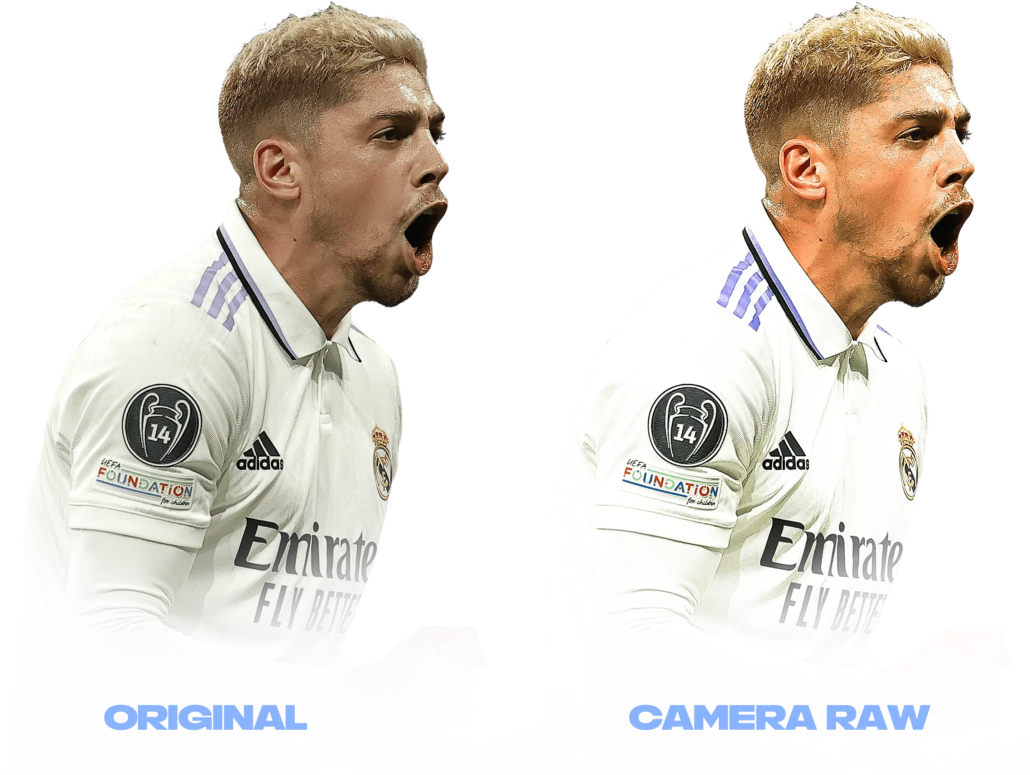
Next up is the curves, here is where the most of lighting changes are made since they make it pop a lot more than the lighting options in the basic group. Here you can follow what I did to the Valverde render on your own renders or try it out for yourself to see what looks best. Just keep in mind not to do too much; just small changes should be made as this is most likely not the final camera raw change you will make on the render and adjusting it too much will make the render look unnatural. What we are going for is a natural look but making it pop more.
As you can see, I also added a bit of sharpening to make the render look like it has a bit more detail. This is primarily noticeable and looks good if you shrink the render down and put it in a card.
Adjusting the colours is very important so the render looks good and has the right amount of yellow, oranges, reds etc. What I’ve done here is change the orange hue slightly to be more red. That’s more of a personal preference, but it looks better and more natural with a bit more of red rather than yellow. I also increased the orange saturation to make it pop more, as well as increased the orange luminance. Here is also the place to adjust the kit colours if you have lost some of the saturation of darkness from the previous steps.
Final Product

